LeanData Brand Refresh
BRAND IDENTITY, ART DIRECTION, COPYWRITING, DESIGN, CREATIVE CONCEPT
LeanData, a powerhouse in Revenue Orchestration, found itself facing a critical disparity. While their platform was the gold standard, their brand identity had begun to lose its luster. In a crowded sector where everyone looks alike, they needed to shine. So, in close partnership with their internal teams, we helped find their new visual identity, one that actually reflected their superstar status.
While we heard a lot from LeanData about what they do and how they do it, it wasn’t until we began our research that we saw their real impact. Revenue operations is one of the fastest growing industries, and some of the biggest players in Silicon Valley, from Snowflake to Palo Alto Networks, were trusting LeanData to optimize their go-to-market processes. We saw this sentiment in client testimonials, but also across message boards and online discussions. People saw real value in what LeanData provided and viewed them as a partner that could empower their processes to be smoother, faster, and more efficient. Not only was LeanData a rockstar, they had their clients feeling like ones as well.
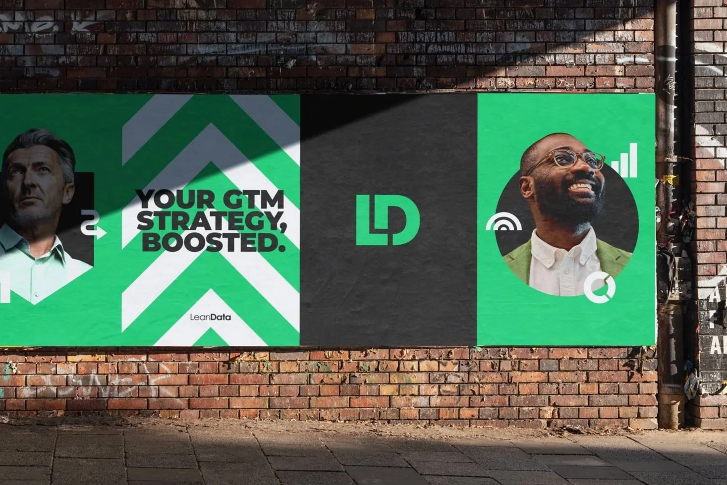
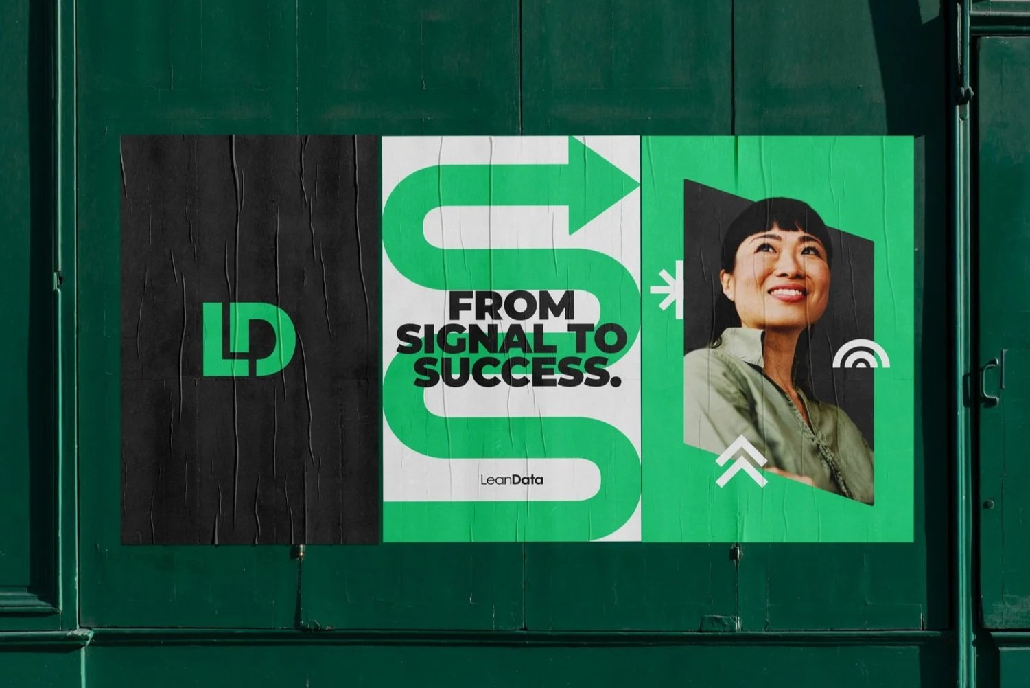
We knew we had to inject that feeling into every aspect of the brand, without disrupting the equity they had already built. Our approach was built on the mantra "Evolution, not revolution”, honoring LeanData's core DNA while sharpening its strategic focus. We simplified their complex value proposition into a singular statement that would became the brand’s narrative backbone: "From Signal to Success".

Once we had a firm grasp on the strategy and positioning, it was time to go to work. We started to evaluate the existing brand, beginning with the core elements of the identity.
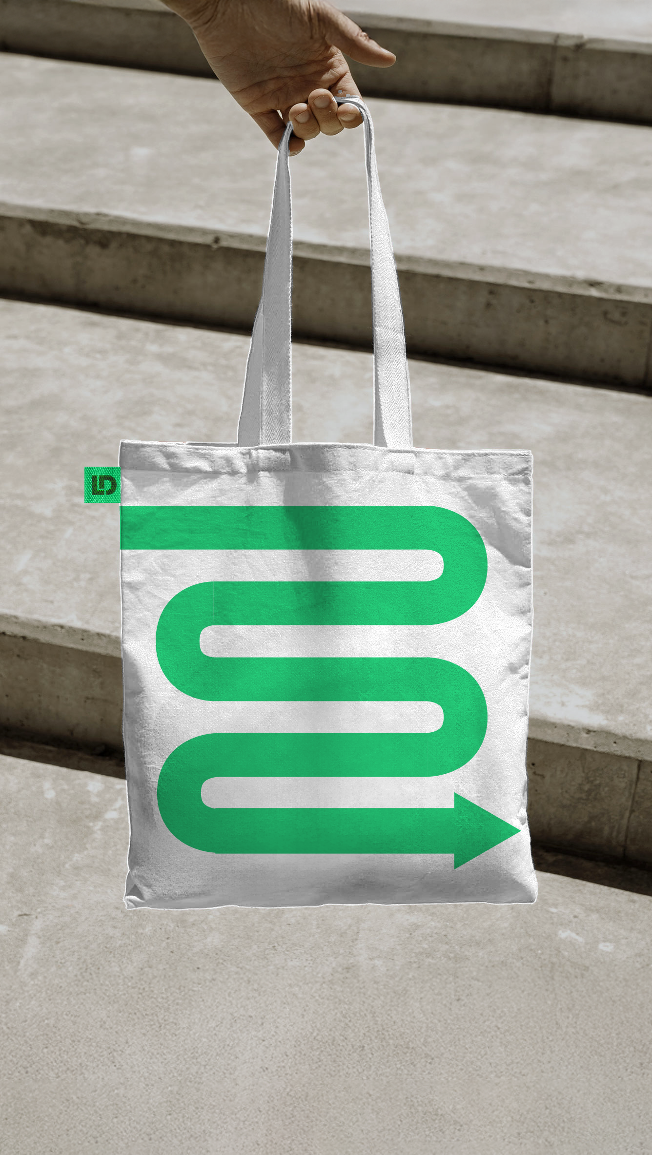
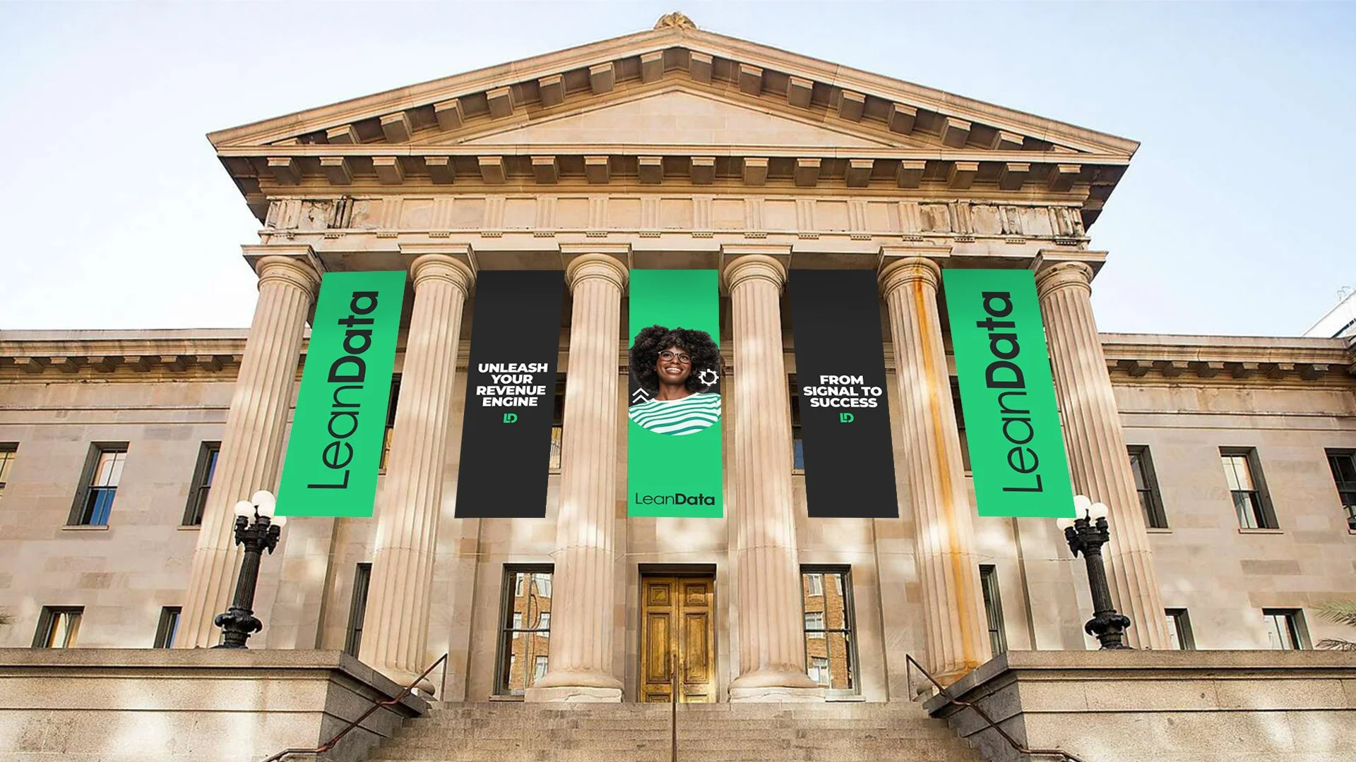
We knew the logo needed a change, so we simplified it, paring it down to the most effective parts. We separated the logomark from the logotype, giving each it’s own place and purpose in the identity. Instead of competing against one another in the existing logo, they could each have their own time to shine in a broader identity.
We stripped down the logomark by removing the circle container and giving space to the letter forms for legibility, scalability, and visual impact. Both the mark and logotype were changed to one color to complement a refined color palette.
No longer would we choose between multiple shades of greens, blues, teals, and grays. A tweaked Lean Green was the new hero of the color palette: vibrant, expressive, and bold.

Alongside empowering portraits and impactful headlines, we developed and incorporated a bold icon library. These icons could be layered alongside the portraits or scaled to encompass the entire canvas. These icons helped to express LeanData’s value propositions and gave a dynamic energy to every brand execution.